iOS and Android App Design and Development
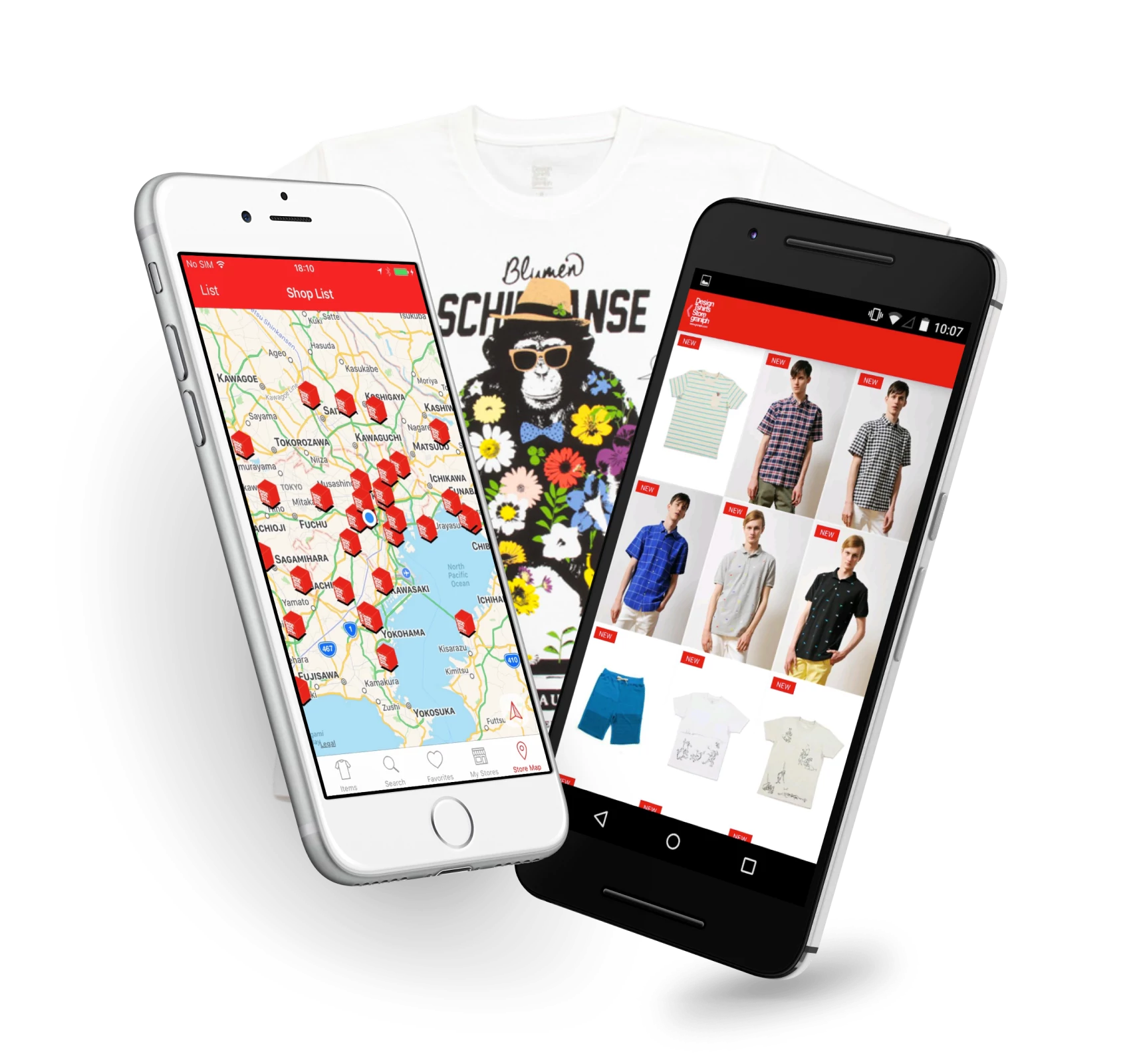
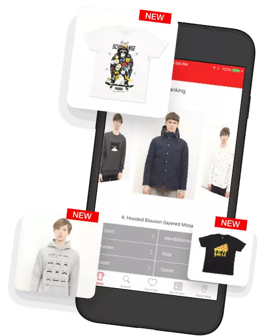
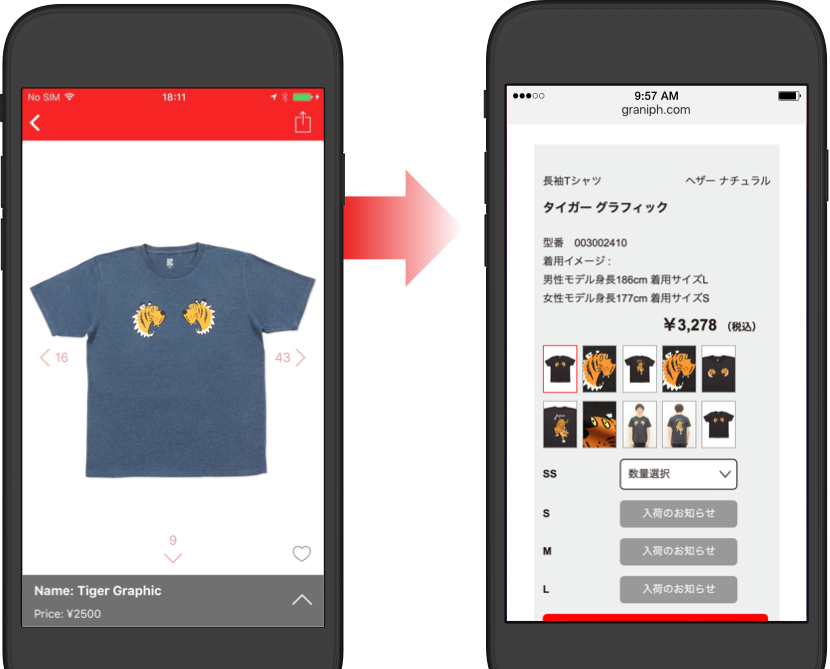
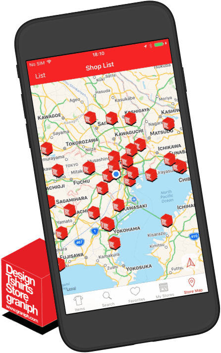
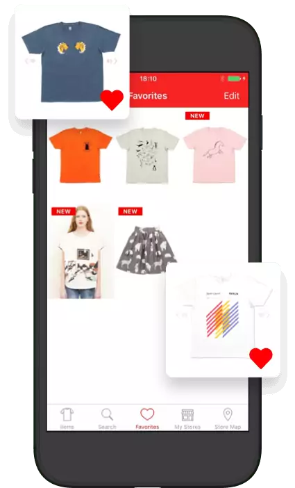
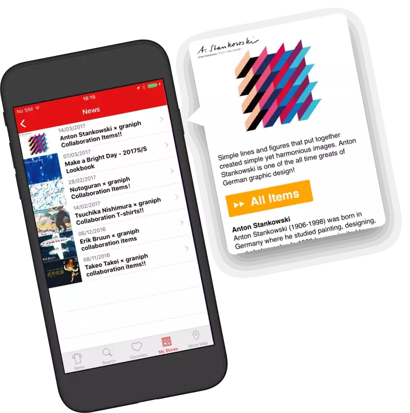
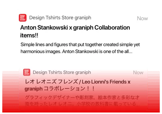
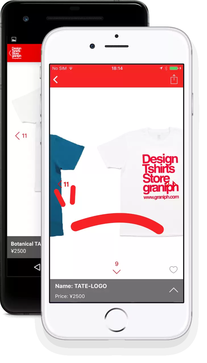
graniph envisioned their customers coming back to the mobile apps every day to check the new product releases. We knew that to achieve this would require us to design a UI that provided immediate access to the new products as a quick effortless microinteraction, without compromising the deeper, slower interaction of browsing the extensive catalog of products. Therefore, with graniph's team, we moved quickly from static designs to rapidly iterated on-device prototypes to ensure we were able to test new ideas in real-world use and make necessary improvements to the design.

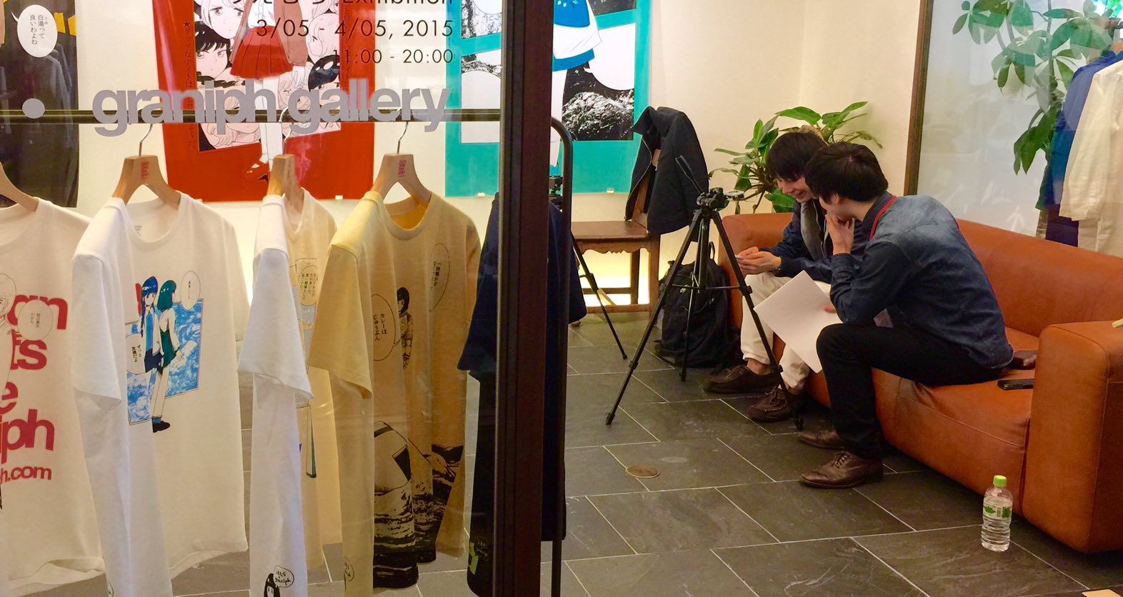
Our research specialist conducting an interview
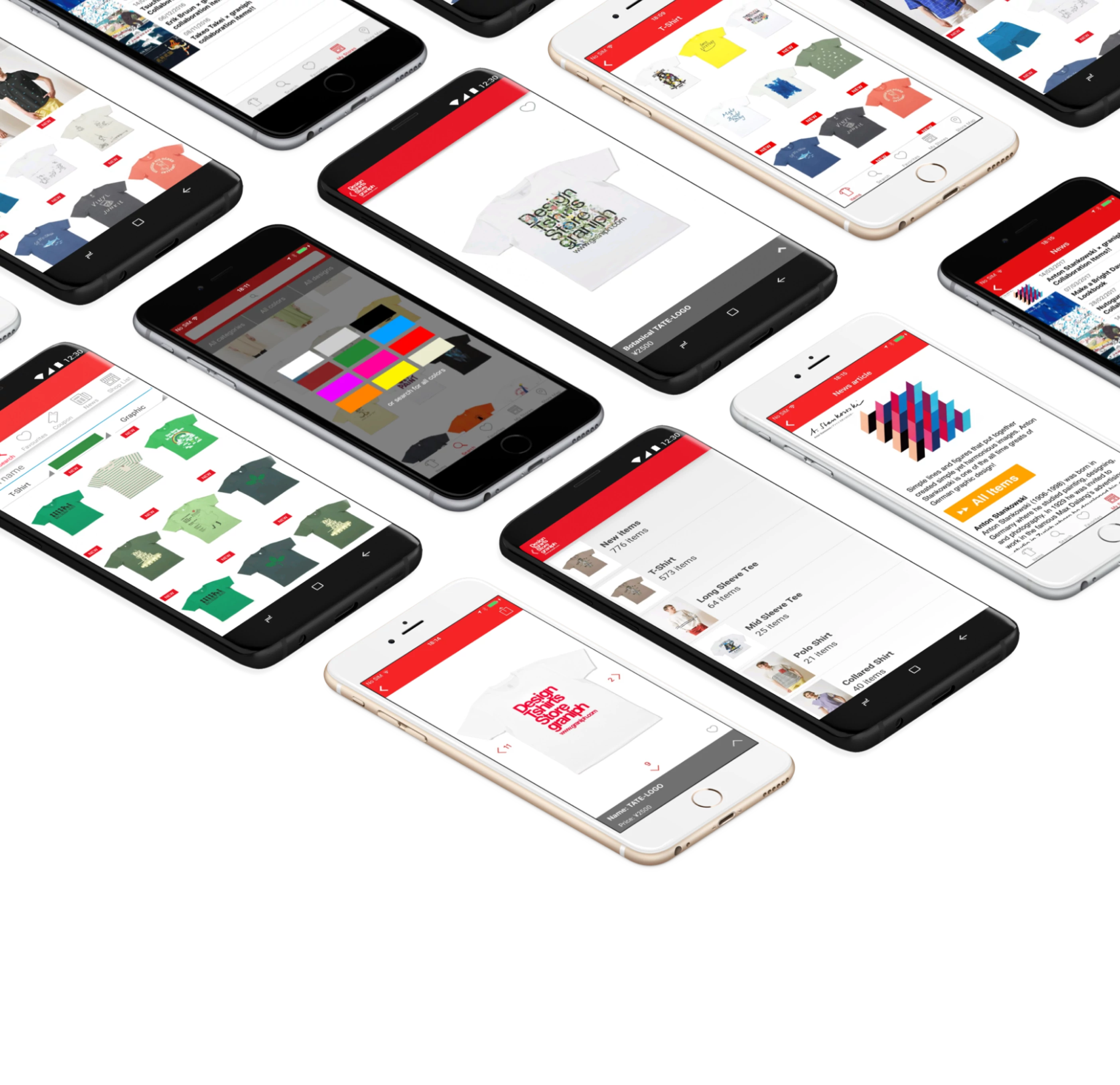
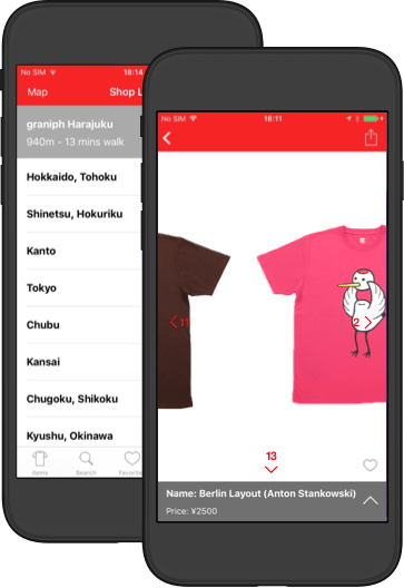
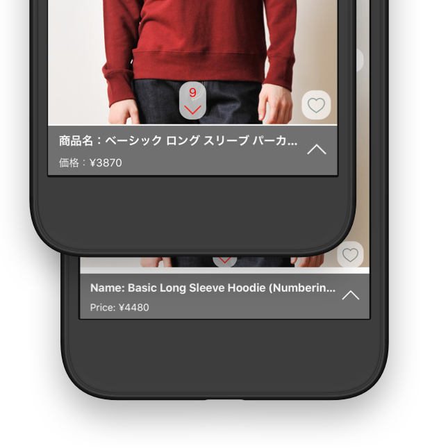
We take the differences in native UI between mobile platforms very seriously at Tacchi, and so another core focus of our design process was on providing a native-feeling experience for both iOS and Android users, staying true to each platforms' design ethos and UI guidelines while maintaining graniph's visual brand identity.
To ensure the performance of the design was optimal, we conducted feature validation and usability testing at various points both pre-and-post release. This enabled us to ensure that we were providing features that were useful to customers, and that they were able to carry out a variety of tasks with the app without trouble.
